Romantic Shots
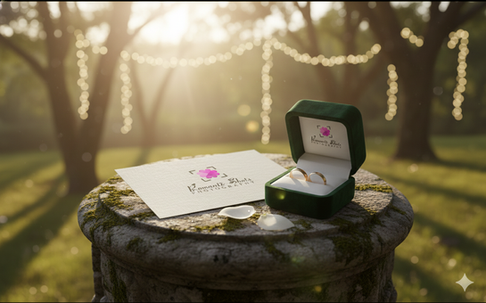
Romantic Shots Photography, a wedding photography service targeting the Inland Empire market, sought a distinctive, high-end identity. The final logo featured a stylized, four-heart floral icon rendered in a vibrant pink gradient, nested within subtle camera viewfinder brackets. The typography paired an elegant, flowing script for the name ("Romantic Shots") with a clean, modern sans-serif for the descriptor ("PHOTOGRAPHY"). This fusion of soft, passionate romance (the icon and color) and crisp professionalism (the frame and sans-serif) was designed to instantly appeal to the target demographic of young, luxury-seeking brides, aligning the brand with the values of Feminine, Young, Luxury, Modern, and Passionate.
Objective & Strategic Intent
The primary objective was to craft an identity that would function as a robust marketing asset and a subtle, high-utility watermark. The strategic intent was three-fold:
Emotional Positioning: To use the innovative heart-petal motif and vibrant color palette to achieve a "Loud" and "Obvious" communication of the brand's core offering—romantic, passionate photography—directly connecting with the client's emotional decision-making process.
Technical Adaptability: To ensure the logo's core icon and framing device could scale down effectively. This was a practical mandate: the design needed to be instantly recognizable and unobtrusive when used as a small digital watermark, preventing piracy while maintaining image integrity.
Aspirational Branding: By blending a classic script typeface with a modern photographic bracket, the design aimed to elevate the brand beyond a transactional service, positioning it as a sophisticated, luxury choice within the regional market.
Outcome
The implemented design delivered a highly cohesive and strategically effective brand mark. The combination of the visually arresting icon and the restrained frame successfully achieved the delicate balance between passion and professionalism. The design's inherent scalability meant it translated flawlessly across all required mediums, from elegant business cards to discreet digital watermarks, validating the focus on practical utility. Ultimately, the logo successfully codified the client's desired persona—a sophisticated, youthful, and high-quality service—providing a distinctive and memorable visual identity that differentiated Romantic Shots from generic competitors and became a key driver for brand recognition and premium pricing strategy.


