Rays Teleradiology
The primary objective was to create a logo that instantaneously communicates the core value proposition of Rays Teleradiology: rapid, high-precision diagnostic analysis delivered globally via digital networks.
The design needed to eschew outdated medical iconography (like caduceus or abstract human forms) in favor of a modern, sophisticated, and technologically relevant symbol. It must project unquestionable reliability—a non-negotiable trait in high-stakes healthcare. We aimed for a logo that feels like a critical thinking tool itself—clean, efficient, and deeply intelligent.
Objective & Strategic Intent of the Design
The core strategic intent was to create a visual asset that transcends traditional medical imagery and aligns the brand with the highly intellectual sector of HealthTech innovation. Objective: To replace visual ambiguity with definitive clarity, projecting unquestionable reliability and the speed of analysis required for high-stakes medical decisions. Strategic Intent: To subtly communicate a digital value proposition. The design needed to assure stakeholders (Hospitals, Radiologists, Patients) that their data is handled within a secure, high-speed, and continuous loop of expert review. It speaks to an "old money" thinking style—focusing on quality, efficiency, and system integrity over transient trends. The design is deliberately clean and efficient, reflecting a No BS operational approach.
Outcome
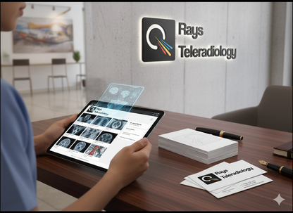
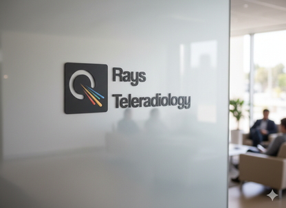
The final design is an innovative visual anchor for the brand. The interplay of the colored rays against the negative space within the loop creates dynamic movement, embodying rapid data transmission and analytical focus. The clean, geometric structure ensures flawless scalability and recognition across all digital mediums (from app icons to reports), making it a highly practical and enduring brand asset. This logo successfully translates complex diagnostic speed and global reach into a simple, authoritative, and memorable symbol of trust.


