Pathway Ability
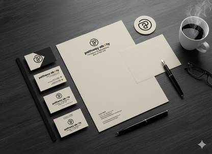
The "Pathway Ability" logo is a contemporary, minimalist wordmark and symbol combination utilizing a clean, balanced sans-serif typeface. The primary color palette anchors on gold/mustard yellow, stark black, and warm white/cream, conveying a sense of quality, stability, and optimism. The symbol—a stylized, integrated form of the letters 'P' and 'A'—is designed as an elegant, continuous loop that suggests both a journey (a pathway) and the enclosing, supportive nature of ability and belonging. The tagline, "PATHWAY TO BELONGING, SKILLS FOR LIFE," clearly defines the dual mandate of the organization.
Objective & Strategic Intent
The strategic intent of this design is to establish a brand that is perceived as professional, trustworthy, and modern, yet deeply humanitarian.
1: Aspirational Trust. The combination of clean lines and the gold accent is intended to attract serious partners, investors, and clients by signaling an "old money thinking style" of unflinching competence and high-standard execution, moving beyond typical non-profit aesthetics.
Strategic Intent: To position "Pathway Ability" not just as a supportive service, but as a premium, impactful catalyst for life change, commanding respect and authority in its sector.
2: Visualizing the Journey and Inclusion. The interlocking 'P' and 'A' symbol, forming a complete circuit, visually represents the pathway (P) leading to a state of ability and inclusion (A). The unbroken line suggests a seamless, supported journey.
Strategic Intent: To communicate the core mission instantly and universally: providing structured, reliable routes to integration and lifelong skill acquisition. It aims to reduce the perceived complexity of the journey for both beneficiaries and stakeholders.
3: Versatility and Scalability. Displayed across various applications (paper, black background, coffee cup), the design maintains its integrity.
Strategic Intent: To ensure the brand is future-proof and practical—easily scalable from a small icon to large print, suitable for both physical outreach materials and sophisticated digital platforms, which is critical for ambitious, forward-thinking growth.
Outcome & Brand Asset Value
The design successfully achieves an outcome of sophisticated, credible differentiation in the social impact sector.
Elevated Perception: The high-contrast, gold-accented palette avoids a conventional, overly-sentimental visual identity. This leads to a higher perceived value and institutional strength, making it easier to secure higher-tier partnerships and funding.
Clear Messaging and Recall: The logo is memorable, analytical, and clean. The simple symbol and clear tagline guarantee instant recognition of the organization's purpose, leading to faster brand recognition and enhanced word-of-mouth efficacy.
Emotional Resonance via Competence: Instead of relying solely on emotional appeals, the design evokes a feeling of security and professional competence. This is highly practical for an organization focused on providing tangible skills and pathways, reassuring users and stakeholders that they are investing in a reliable, high-impact outcome.


