ClickDrive
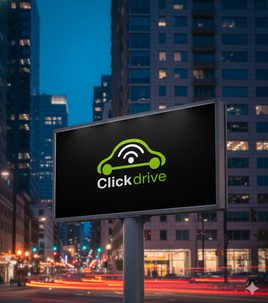
The project necessitated a high-caliber visual identity for ClickDrive, a disruptive automotive platform positioning itself as the "iPhone for cars". The client required a precise balance: appealing to the tech-savvy, performance-oriented demographic—men aged 20-50 who favor "Fast & Furious" aesthetics—while remaining accessible to pragmatic users, such as parents monitoring safety or fuel economy. The core challenge lay in engineering a symbol that communicated advanced technology without alienating the mass market or appearing overly niche. We synthesized these requirements into a cohesive vector, leveraging the requested "Web 2.0" aesthetic—specifically rounded corners and vibrant gradients—to denote modernity. The resulting design integrates a stylized vehicle with a universal connectivity signal, effectively visualizing the convergence of automotive hardware and digital software.
Objective & Strategic Intent
The strategic objective was to engineer a brand mark that serves as an immediate visual shorthand for "connected driving" within a competitive landscape populated by rivals like Automatic and Moj.io.
Visual Synthesis: The intent was to embed the WiFi signal—the universal signifier of data—directly into the chassis of the vehicle. This signals that connectivity is the "engine" of this platform.
Demographic Bridging: To address the dual audience, the design utilizes a stark, high-contrast color palette. The lime green suggests energy and eco-efficiency (appealing to the cost-conscious parent), while the sleek black typography and automotive silhouette anchor the brand with technological authority (appealing to the enthusiast).
Scalability: The strategy prioritized a clean, icon-driven design (Acme style) that remains legible whether on a mobile app interface or a physical business card.
Outcome
The final execution successfully established ClickDrive as a forward-thinking entity in the automotive IoT space. We delivered a robust suite of layered vectors (EPS & PDF) and screen-quality assets that met the strict technical specifications for digital and print application. The resulting logo navigated the complex demographic requirements by presenting a clean, "next-generation" aesthetic that was inclusive rather than alienating. By centering the design on the recognizable symbol of a car emitting a digital signal, the brand identity effectively communicated its utility instantaneously, positioning the client to compete aggressively against established market players.


